Author: Erice Martin, Physical Education Teacher, Department of Education, Philippines
According to research from the University of Missouri, visual aids like graphics and images can improve a person’s understanding and memory of information by as much as 89%.
Graphic design has a big impact on public image and behavior, whether it’s for a business or a personal brand. In this article, we’ll examine the numerous components that graphic design uses to promote a healthy lifestyle.
We’ll show how design may be utilized to effectively communicate your message and motivate change, from using suitable colors to using uncomplicated and clear fonts.
Using Graphic Design to Captivate and Educate
The power of graphic design to draw people’s attention is one of the most key benefits it has in maintaining a healthy lifestyle. Bright colors, strong graphics, and unique font can draw the audience in and help the information retain in their minds.
This is crucial for promoting healthy habits because it can be difficult to convince individuals to pay attention to health-related information.
The impact of public health ads can be increased by up to 30% by combining vivid colors, bold imagery, and easy-to-read writing, based on research by the Centers for Disease Control and Prevention.
Graphic design can also improve the accessibility and interpretation of medical information. Infographics, charts, and other visual elements can aid in comprehending and retaining complex information. This is especially useful for educating people about health risks and the benefits of adopting healthy habits.
According to American Medical Association research, using graphics and visuals to communicate health information can increase comprehension by up to 74%.
Designing with a Healthy Lifestyle in mind: Keep it Bright and Lively
It is vital to use a consistent color scheme, typography, and graphics throughout all designs when promoting a healthy lifestyle through graphic design.
This creates a consistent brand identity and aids in the development of audience trust and confidence. Here are a few design tips for using color, images, and fonts.
-
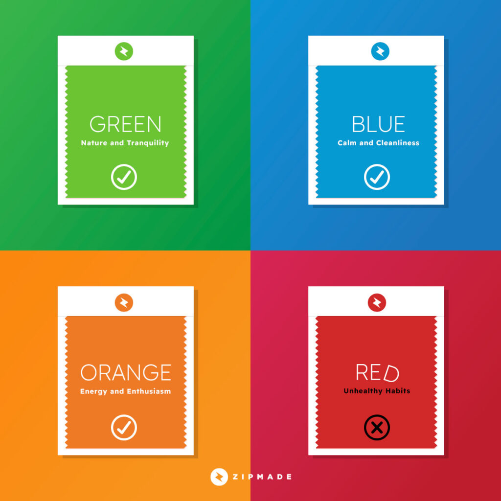
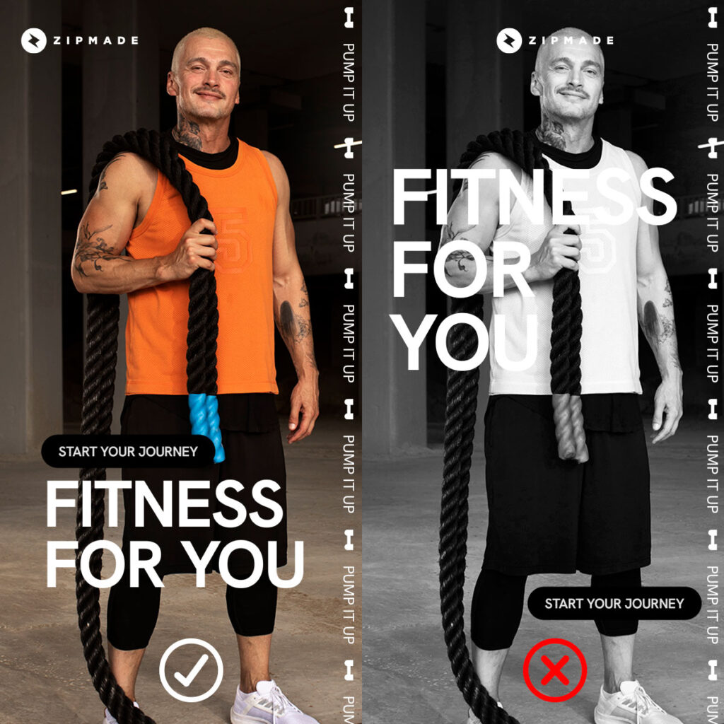
- Color: It’s crucial to pick colors that are bold and appealing in order to grab attention and radiate vitality and optimism.
Use colors that are associated with health, such as green for nature and tranquility, blue for calm and cleanliness, and orange or yellow for energy and enthusiasm.
Avoid colors that are associated with unhealthy habits, such as red for junk food.
You can use these hues in your logo, images, and other design components to draw the audience in and identify your business from competitors.

The viewer’s emotions can be awakened or a sense of importance can be conveyed by using the right colors. So while red is usually associated with junk food or fast food, using the color red on “call to actions” might produce a desire to act and motivate the viewer to act. -
Images: Use images that depict a healthy lifestyle, such as people exercising, eating healthy food, and enjoying outdoor activities. Avoid images that show unhealthy habits, such as sitting in front of a screen all day.
It can be easier to express a healthy and active lifestyle by including images of nutritious foods, exercise equipment, and energetic people. These pictures can act as reference points, reminding readers how important it is to practice healthy behaviors and motivating people to change their lives for the better.
However, it’s important to consider cultural sensitivity, representation, and inclusivity while employing images. Using a diverse range of photos that accurately depict the target demographic is essential.
Images can be used to encourage healthy habits through gamification. The use of game design features in non-game contexts to engage and motivate individuals to accomplish their goals is known as gamification. Organizations can increase the likelihood that individuals will adopt and maintain healthy habits by incorporating elements such as points, badges, and leaderboards into health campaigns.
-
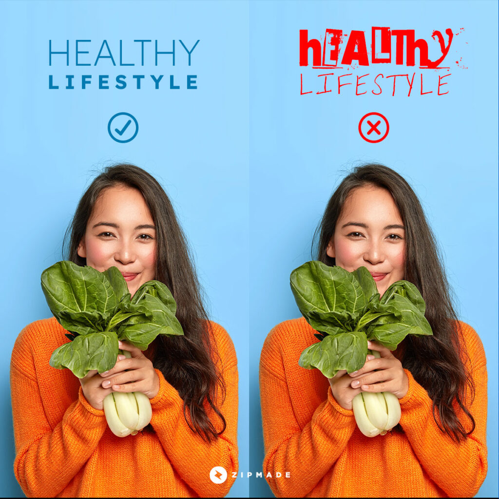
Fonts: Use clear and simple fonts that are easy to read, such as sans-serif fonts. Avoid using overly decorative or stylized fonts, as they can be difficult to read and take away from the message of promoting a healthy lifestyle.

Use a clear, modern typeface to express a reliable and professional impression. This will make your writing easier to read and understand and give your brand a modern, friendly presence.Use simple fonts instead of decorative or detailed ones because they are easier to understand and may give your brand a less trustworthy appearance. Furthermore, it is critical to use a modern, clear font to create a polished and credible appearance.
-
Use negative space: The space between and surrounding design elements is known as negative space. By strategically utilizing negative space, you can give your design a sense of simplicity and elegance while also giving your business a more upscale and professional appearance.
Negative space can also convey minimalism and simplicity, which simplifies the content.
-
Consistency and Balance: It’s vital to use the same color scheme, typeface, and imagery for your projects to establish a consistent brand identity.
This will make your brand more identifiable and assist you in creating a powerful, memorable brand that people will associate with your company.
Ensure that the colors, images, and fonts you use are consistent across all marketing materials, such as posters, flyers, and social media posts. This helps to build brand recognition and makes it easier for people to identify your message.
Use color, images, and fonts to create balance in your designs. Too much of one element can be overwhelming and take away from the message you are trying to convey.

Remember, the key to effective design is to keep it simple, clean, and consistent while effectively conveying the message you want to send.
- Color: It’s crucial to pick colors that are bold and appealing in order to grab attention and radiate vitality and optimism.
Closing
Information coupled with effective graphic design can help foster trust and credibility. Your content will have a more persuasive design and encourage people to develop healthy behaviors.
While graphic design can be an effective tool for promoting a healthy lifestyle, it should not be the only tool used. To create a truly healthy environment, a comprehensive solution that includes education, policy changes, and community-based interventions is required.
Graphic design, when combined with other strategies, can be an incredibly powerful tool for promoting healthy habits and improving the overall health and well-being of individuals and communities.
Zipmade can help you effectively communicate the importance of healthy habits and inspire people to make positive changes in their lives by leveraging the power of graphic design. Send us a message and we will respond as soon as possible.


