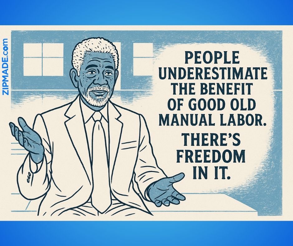
Making QR code mistakes in designs for e-commerce and event marketing is something common. To leverage eyeballs with QR codes is crucial and small detail counts. Maybe this is why it’s easy to miss, especially when it comes to the graphic design of your promotional materials. One small oversight, like a badly placed QR code on a pull-up tarpaulin poster, can be the difference between engagement and being ignored.
At Zipmade, we recently created a sample poster for an internal review, and it quickly became a teaching moment. We intentionally added a few design don’ts — and guess what? We nailed every mistake on the list… so you don’t have to.
Let’s break down the most common QR code design mistakes and how your business can avoid them.
🚫 Common QR Code Mistakes We Still See Everywhere:
1️⃣ QR Code Too Small
If your audience has to squint or zoom in from 5 feet away, your QR code size isn’t working. This is especially critical for pull-up banners, which are often viewed from a distance. Small QR codes are difficult to scan and easily overlooked.
✅ Pro Tip: For posters and tarps, keep your QR code size at a minimum of 2 x 2 inches, and go larger if the viewing distance is greater.
2️⃣ Poor Placement
Placing your QR code at the very bottom of the poster? People might miss it completely. Placing it too high? It becomes awkward to reach or scan. Both mistakes lead to lost conversions.
✅ Pro Tip: Place the code between waist to chest level, ideally where your audience’s eyes naturally go when standing in front of the display. This makes scanning quick and intuitive.
Just to emphasize this, here’s another bummer that unfortunately escaped my quality questing eyes – shame on me.
3️⃣ No Contrast or Visual Clutter
If your QR code blends into the background or is surrounded by text and graphics, it loses effectiveness. Codes need white space to breathe and solid contrast to be scannable.
✅ Pro Tip: Keep at least 15-20% of clear space around the QR code, and use dark code on a light background or vice versa.
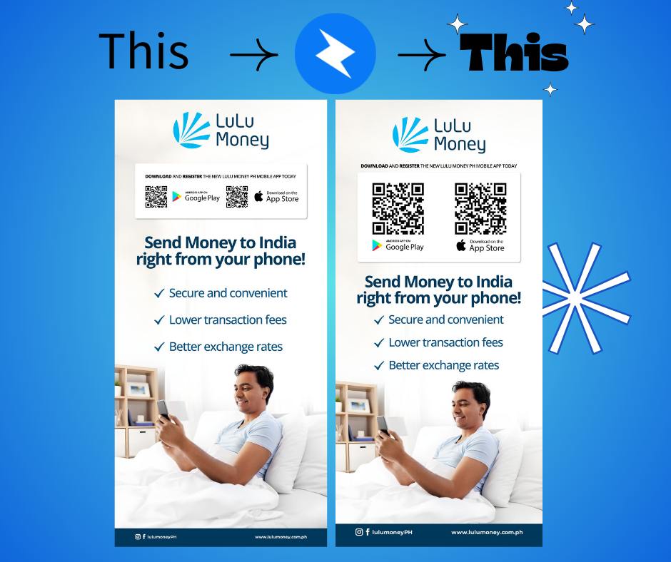
Before & After: The Zipmade Fix
In our poster, the first version had a tiny QR code placed at the bottom, surrounded by icons and a busy background. Not ideal.
We corrected it by:
- Repositioning it at chest height
- Enlarging it for easy scanning
- Simplifying the area around it for better visibility
The result? A much more effective poster that does its job: invites engagement and drives action.
Why This Matters for E-Commerce & Event Marketing
Whether you’re running an online store, managing an event launch, or promoting a new product, your visual materials need to perform — not just look good.
If your goal is to drive traffic to your website, product pages, or event registrations using QR codes, placement and design are everything.
At Zipmade, we help businesses:
- Design high-converting print materials
- Optimize visuals for engagement
- Avoid common branding pitfalls like ineffective QR usage
We’re not just another design agency — we’re your on-demand graphic design team, specializing in fast turnarounds, smart branding, and consistent results for e-commerce stores, event companies, and startups that need scalable design solutions.
Need Graphic Design Support for Your Next Event or Campaign?
Don’t let design errors cost you conversions. If you’re looking for event graphic designers, graphic designers for hire, or simply need an overflow design team that can jump in and get things done — Zipmade is here to help.
👉 Let’s talk!
Send us a message to learn how we can support your next campaign.